Posted by Diggory Gordon
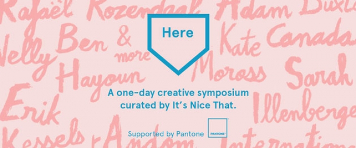
Last year a few of us went to a great series of talks and interactive lectures called Here, curated by the fantastic It's Nice That blog.
Among the gems and insights into what makes a cocktail with khat, and Guiness taste like it does, was some advice by Paul Smith.
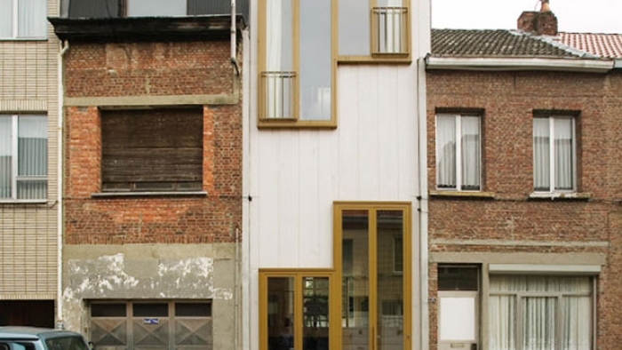
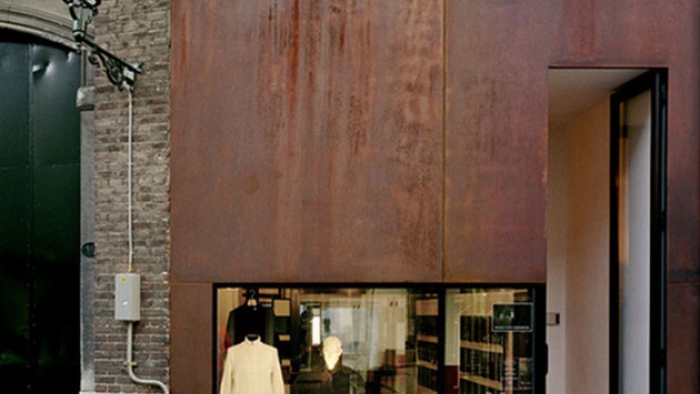
Paul Smith has always been a big believer in the shop front. Lay out your wares in the most engaging way visually and people will come to you. From Miami crisp decadence to a red brick west London hideaway, he’s never shied away from making bold brand statements architecturally, which fit in with their surroundings. The shop front becomes an extension of his brand and all his eccentricities.
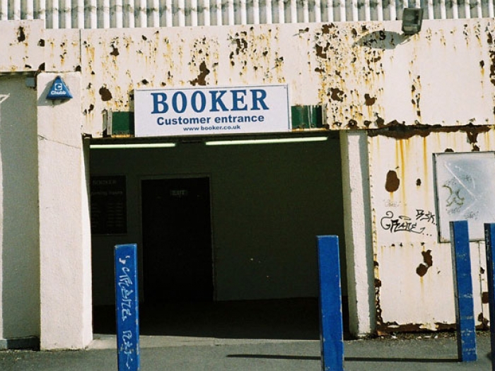
The photo above is a wholesale supermarket behind our studio, before they rebranded and decided to inflict orange over everything. You can almost feel the branding agency making the pitch... consistancy of message... impactful... memorable. Maybe it’s just me, but I prefer it how it was.
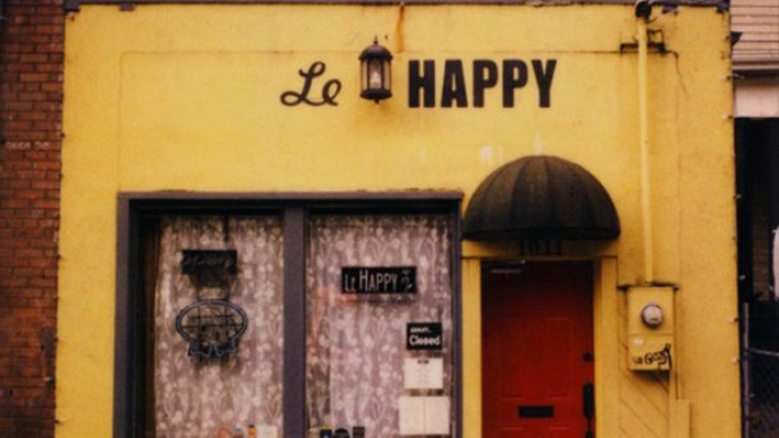
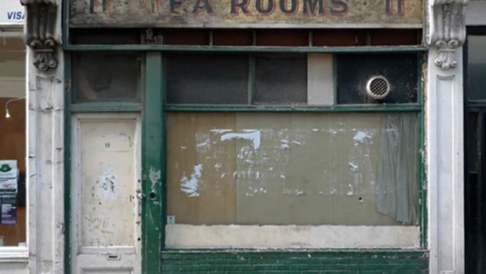
It got me thinking about what attracts me to brands on the high street. I find myself drawn to stores and buildings with such minimal branding and wayfinding it would give a PR company nightmares. They say less is more, but what about nothing at all? That run down shop or pop up restaurant in an old hairdresser’s, with the A4 menu blu-tacked in the corner, seems to hold the most appeal to me. What does this say about me as an individual? I could say something about discovery and sophistication (as if!) but I won't gloss over the fact that right now I love the anti-design as much as I love the design itself. Next week it might change to a comic sans poster in the charity shop window down the road. Who knows?
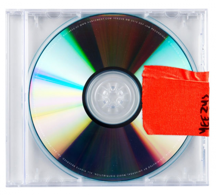
Maybe Kanye West is on the same page too. His latest album cover paying homage to the days of the bootleg mixtape is brilliant...
The upcoming movie poster for Anchorman 2 shows less really is more. That moustache and shirt do more than a great big logo could ever do.

This week we head back to Here, and with speakers such as Kate Moross, Adam Buxton and rAndom International, it’s bound to be just as good as the last one. This time, I think I’ll say no to that khat cocktail though.