
Posted by Tamsyn Strike
In the competitive world of e-commerce, it’s important that the design and structure of your online store makes a good first impression on prospective buyers.
It directly effects the way customers feel about your brand, how much time customers spend on your website and ultimately, how much they spend.
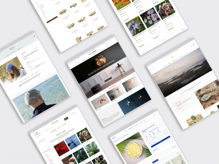
Here are 12 tips that we’ve applied to our clients’ e-commerce stores to help improve the usability of their sites and increase conversions.
1. Create easy to use navigation
Top-level navigation plays a crucial role in conversions, so it’s important to not confuse your customers. Be sure to use obvious product category and sub-category labels and group them logically.
Use your expanded sub-category menu to display special promotions or sub-categories you want to push.
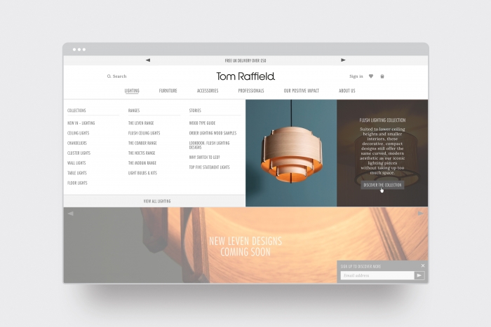
2. Keep the hero section simple
The hero section is the most prominent element in a site’s visual hierarchy. It’s often the first thing a customer sees when arriving on a website. It needs to use simple, uncluttered design with as few words as possible, focusing attention on a single call to action.
Establish where you want to filter customers: it could be a newly launched product or range or a product that needs more prominence.
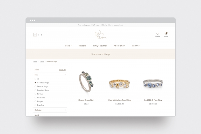
3. Include breadcrumbs
Breadcrumbs are an integral navigation element, as they help customers to know their location within the hierarchy of the website.
They’re particularly useful to customers who’ve landed on a page from an external link, such as a search engine, as they provide the user with a clear understanding of where they’ve landed – and an easy way to skip back a few levels.
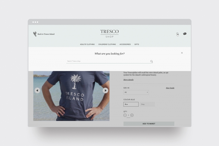
4. Add product search
Many customers will choose to skip the navigation menu and rely entirely on search.
Search can get complicated from a development and cost perspective, so it’s best to introduce a product search once your site’s categories have over 20 products.
5. Optimise category pages with an introduction
A simple introduction will help customers to quickly establish which products are within a category, while also improving your site’s presence on search engines.
It’s important to make the text user-friendly, keeping keywords relevant and informative.

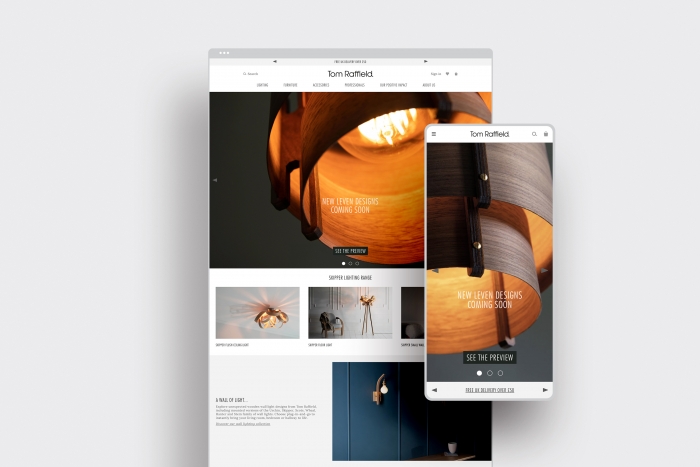
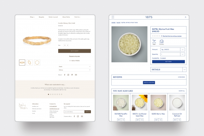
6. Use quality product photography and videos
Without an opportunity to view products in real life, photo and video representations are all the customer has to go by. For that reason, it’s important that the quality of your photography reflects your brand and shows each product’s quality and value.
It’s important to feature product-only images, displaying the product at different angles, alongside a supporting in-context image, showing your product being used in its intended environment or alongside complimenting products.

7. Include reviews on product pages
Including customer reviews or testimonials on your product pages can be a powerful tool to convert your visitors into buyers.
By displaying reviews, you’re showing new visitors that you’re a trustworthy seller.
Which leads us onto our next point:
8. Make it easy to leave a review
The easier you make it for customers to leave a review of your products, the more likely you are to get reviews. Include a review section on every product page.
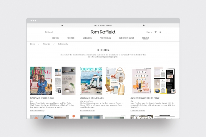
9. Add social proof
In addition to customer reviews, social proof makes online customers feel more comfortable purchasing from an e-commerce store.
If your product or brand has been mentioned in the media – such as magazine features, reviews or television segments – take excerpts and include them on your website.
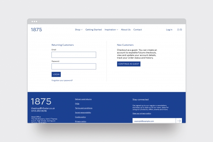
10. Add a guest checkout option
There are many arguments against guest checkout from a retailer's perspective; however, it’s a great way to reduce cart abandonment.
It’s easier for mobile users, gets shoppers straight into payment forms, and makes the checkout seem less work.
You can still add the option to create an account at the end of the checkout process.
11. Break up the checkout process
When a customer decides to make a purchase, they don’t want to be bombarded with an endless page of fields. Instead, break up the checkout process into digestible chunks.
For example:
- Contact and shipping details
- Shipping method
- Payment
- Order review
12. Include a progress bar
Prominently display the customer’s progress through the checkout journey. Make it clear what step they’re on and how many steps are left in the process.
Without it, you risk your customer growing fatigued and abandoning their cart.

With ever-increasing numbers of customers now choosing to shop from home, it’s important that any online store is well set-up, well managed and easy to use. If you’re worried about falling behind, get in touch with us for a chat about how we might be able to help.