Posted by Nixon
There are some things that digital design just can’t do. Analogue methods such as illustration, collage, linocut and screen-printing create unique, standout pieces.
Here are four brands and designers whose analogue artwork we particularly like.
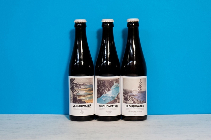
Cloudwater Brew Co – collage
Cloudwater Brew Co is a Manchester brewery specialising in modern, seasonal beer. As the seasons change, their beers and labels do too. Since 2014, Textbook Studio has worked with Cloudwater on their branding, logo and label design.
For the brewery’s 2016 autumn range, Textbook teamed up with two-piece creative studio DR.ME. DR.ME created a set of collages, which they two- and three-colour Riso printed to produce a range of eye-catching pieces. Textbook then used the collages in their label design. Using an analogue printing method for the artwork portrays the ethos of Cloudwater Brew Co, with their hands-on approach to crafting new and exciting flavours as the seasons change.
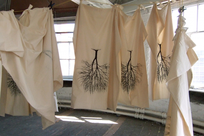
UHC, ‘Spring Shrouds’ – screen-printing
UHC was a collaboration of artists, social activists and anti-consumerism campaigners based in Manchester. For their project ‘Spring Shrouds’, led by artist Jai Redman, they created and installed handmade canvas shrouds, placing them over street-based advertising hoardings. This gave the city a temporary sense of peace from the ever-growing chatter of street advertisement. Each shroud was screen-printed with a simple illustration of a tree and the copy ‘trees breathe adverts suck’. The choice to screen-print this image onto the shrouds creates a natural feel that resonates with the anti-consumerism pro-nature message.
Unfortunately, UHC disbanded in 2014. Their website is now archived but still contains all their work for you to see and read about. Just click ‘Continue to the archived site’ at the bottom of their landing page.
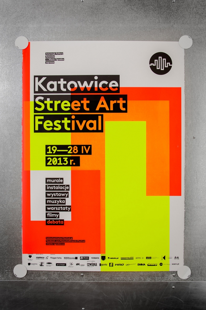
Katowice Street Art Festival 2013 – screen-printing
Polish graphic designer Marta Gawin used screen-printing to produce the visual identity and printed collateral for the Katowice Street Art Festival 2013. When talking about the festival, organisers often used words such as ‘dynamic’, ‘diversity’ and ‘uniqueness’. The visual identity Gawin designed represents this through the print medium. Each poster has been screen-printed in two neon colours using a geometric pattern based on the festival logo, with a black layer for the typography. Using six different rotatable plates, each with its own geometric figure and fluorescent paint, Gawin created 62 unique designs. By doing this she succeeded in creating a dynamic, diverse and unique identity for the festival.
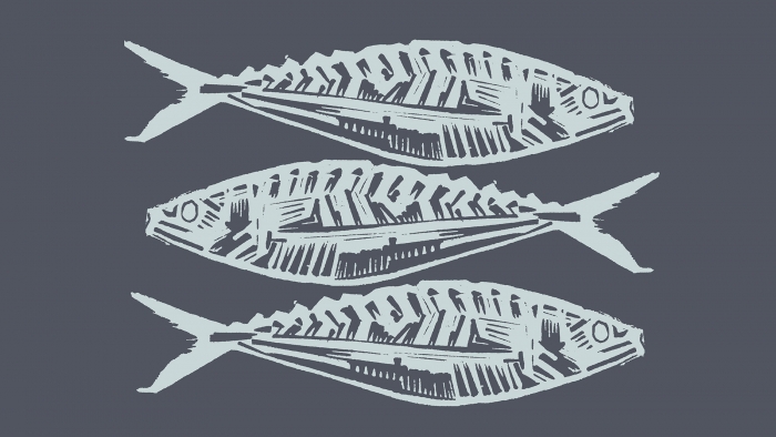
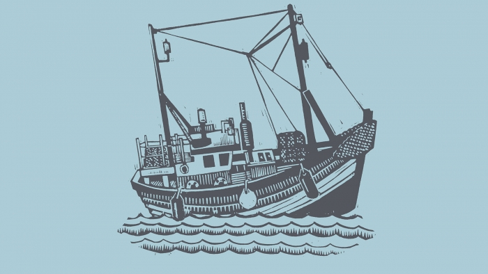
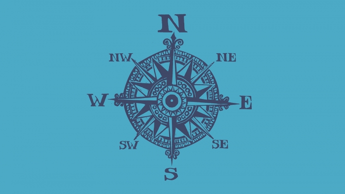
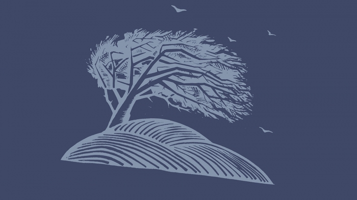
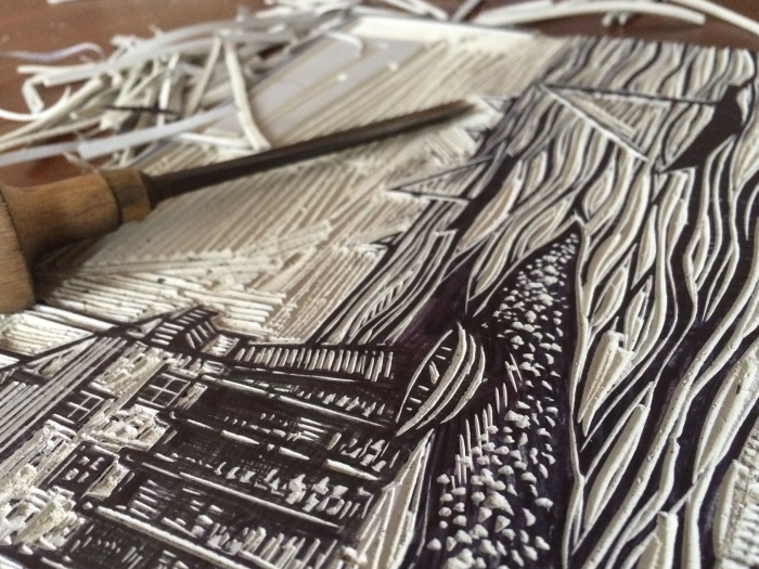
Latitude50 – linocut
Latitude50 is a great example of how one of our own clients uses analogue print methods to stand out from their competition with unique and effective visuals. With an increasing number of self-catering holiday accommodation agencies in Cornwall, it was important for Latitude50 to communicate its quality and character.
We commissioned artist and printmaker Edward Farley to create a selection of linocut illustrations to complement and balance the brand identity. They create a sense of authenticity and personality, and the final two-tone prints visually reflect the overarching ‘50/50’ design approach, with the layout based around symmetry and dividing lines.