

Posted by Sarah Weigold
How would you feel if 10% of people couldn't get the information they needed from your website? Or felt excluded by your posters and leaflets? Or failed to complete your forms? With 6.3 million dyslexics in the UK, it’s likely that one out of every 10 people interacting with your brand is dyslexic (with potentially many more still undiagnosed).
As such a large chunk of your potential audience is affected by dyslexia, taking steps to help them access your content seems like a no-brainer.
But accessible design is a dreaded concept among designers (even though we’re disproportionately dyslexic ourselves), conjuring up images of bland sameness, insipid yellow backgrounds, 20pt text and – worst of all – Comic Sans. But you don’t have to sacrifice good taste in the name of accessibility. Here are some small tweaks that will make reading easier for dyslexic users without ruining your design.
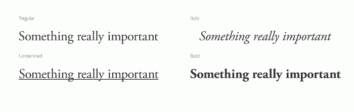
Be bold.
We all use word and letter shapes to read, but shape recognition is a particularly important tool for dyslexics. Underlining or italicising text really messes with the word shape, so if you need an element of your text to stand out it’s best to make it bold.
Go big or go home.
Most readers will benefit from bigger text. While you don’t have to make every piece of design the size of motorway signage, increasing text by a few point sizes won’t hurt anyone.
Save your serifs for headers.
Fonts with serifs (an extra stroke at the end of a larger stroke) often have less clearly defined letter forms, making them harder to read, especially for dyslexics. There’s no harm in using a fancy serif font for beautiful large titles, but stick with a sans-serif font for smaller and less legible body text. Pairing serif and sans-serif looks great, so there’s no trade-off between aesthetics and accessibility in this case.

Minimise mirroring.
If you’re trying to pick a dyslexic-friendly font, look for one with the least letter mirroring. Dyslexics mentally flip letters while reading, meaning that we easily confuse b for d, or p for q. A font where these letters look less similar will be easier to read without errors.
Special fonts.
Every now and then, the internet gets overexcited about a new font that will fix dyslexia once and for all. Personally I’m sceptical, as the research behind these seems to be lacking. But even if I were utterly convinced of their effectiveness, I still wouldn’t use one because – much like the orthopaedic shoes I was supposed to wear as a kid – to me, the ugliness far outweighs the potential benefit.
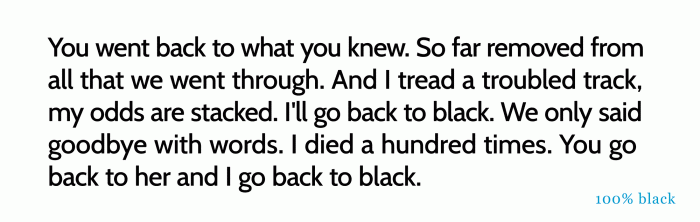
Grey is the new black.
The standard combination of black text with a white background is actually pretty hard for most of us to read, as the high contrast causes eye strain. This effect can be especially bad for dyslexics who often experience visual stress while reading. Instead of using 100% black text, lower the contrast by using a 90% black or an off-white background – obviously don’t reduce it too far, as some contrast is useful. Or, why not jump on the current trend for dark text on pastel backgrounds?
Enable colour changing.
Dyslexic users may have browser add-ons that change the colours of your website. Make sure your site is set up correctly for colour changing with this guide, otherwise it may not be displaying correctly.
Chill out on the all caps.
Avoid using fully capitalised words in body text. Firstly you’ll just look like AN ANGRY TWITTER TROLL, and secondly, you’ll make it harder for dyslexics (and anyone else for that matter) to read. Save your capitals for maximum impact on important headlines.
The more headers, the better.
When reading, dyslexics will often lose their place, skips lines or misread. Introducing descriptive headers into text will help with returning to the right section to reread. Studies show that people generally only read 20 to 28% of text on a web page, so using headers when writing for web will also help skim readers find the information they’re after.
Get to the point.
Breaking up long chunks of text into bullet points reduces word count and presents information in a structured format, making it easier for anyone to read and digest.
Keep your columns tight.
Dyslexics can easily get lost when reading along a line. This can be helped by reducing line length. In print you’re aiming for 50-75 characters per line, and on web you can go a bit bigger, maybe up to 95. Bear in mind that going for really short lines can also be problematic as that introduces lots of line breaks and jumps.
Big up word spacing.
For dyslexics, the more space between words, the better. This can look weird if you take it to the extreme but it can be done subtly. As a minimum, make sure not to reduce word spacing to fit a line of text into your layout.
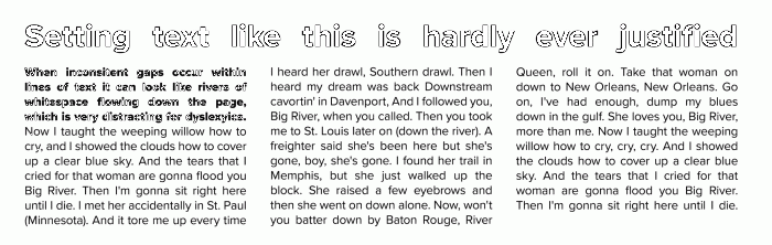
Don’t justify.
Justifying text to make columns the same width creates really weird word spacing, which is super-distracting for dyslexics. As a side note: nothing says ‘this was designed in Microsoft Word by the boss’ teenage son’ like justified text. Stick with aligned text for maximum readability.
Show rather than tell.
An image says a thousand words, so why not communicate through icons, diagrams or video instead of written text? Fewer words are better for everyone viewing your site – especially children, non-native speakers and the easily bored.
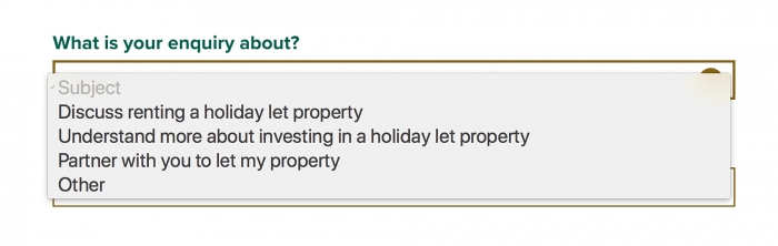
Keep forms short.
No one likes filling in forms, but to the dyslexic it's a particularly painful experience. Keep your forms short by only asking questions that are absolutely necessary rather than just duplicating a catch-all standard form. Reduce the need for typing and spelling by using multiple choice answers, dropdown menus and auto-complete options.
Test, test and test again.
The only foolproof way of knowing if your design works for someone is to let them use it and then listen. If you’re non-dyslexic you’ll struggle to notice things that could be making it harder for dyslexics, so test it out on them. Dyslexia affects all people differently – some might struggle with colour, others will have more of an issue with fonts, so the more opinions you get, the better.
If you found this interesting, you might like How to create an accesible website.