Posted by Nixon
Miriam
Meridian recently posted that it’s taking part in a Loop initiative with Tesco, in which its packaging will be professionally cleaned and reused. It’s currently being trialled in 10 stores in the UK (sadly, none are in Cornwall) but I would love to see this happening across other supermarkets! Meridian isn’t the only food brand signed up for this either – Brewdog, Tetley, Sipsmith, and a whole host of others, are also in on the action.
Ryan
What colour do you imagine when you think of a link? Those of us with a vision impairment will probably think of blue, but why blue? Why have the likes of Google, Bing, the BBC, and even the UK Government, all chosen blue as their link colour, and who started it?
Mozilla (the makers of the Firefox browser) recently tried to answer this question. To find out where this began, we have to look back to 1993 when it was first implemented in the Mosaic browser. Before Internet Explorer arrived, Mosaic was the standard web browser and was available across multiple platforms, making blue synonymous with the link. When Internet Explorer entered the market, it made sense to follow the established convention – and many have followed that convention since.
Why Mosaic chose blue is up for debate. Some say it was a deliberate choice as less people have a blue colour deficiency, or that blue offered the most colour contrast on colour screens at that time, while others say it was just a personal choice.
So should all links be blue? That’s up for debate; some say we should stick to well-established conventions, others that as long as links look interactive, it's okay. What is clear, though, is the power of conventions within user experience design and how it's not always clear when to break convention.
Megan
I was recently interested to read an article about illustrator, artist and hand-repair guru Molly Martin, who’s made an art form out of ‘make do and mend’. Her book, The Art of Repair, offers tips on how to mend your own clothes in a way that is creative and celebratory, rather than hidden away. The process of mending draws upon ancient textile techniques, and many of Molly’s repaired garments are interwoven with rich stories and memories. My technique might not be comparable with hers, but I feel inspired to give it a go. If you’re outside Cornwall, Molly also runs repair workshops through Toast.
Diggory
“A load of old bollocks”.
I don't really like being critical of other people's work. It somehow doesn’t seem fair when I haven’t seen the brief, met the client or understood the problem, but sometimes you have to call something out.
With our target to become carbon net zero by 2050, it’s only right that brands make the tough decisions now to accommodate the changes that we all need to make to meet this deadline. Much has been written about ‘green-washing’ and just how see-through this is at a consumer level. After reading a great article from the original designer of the British Rail logo, Gerry Barney, over at the Guardian, it seems right to comment.
Somehow they’ve managed to make one of the most aesthetically pleasing and memorable marks worse. With shades of green to symbolise inclusivity and green to errrr.... represent nature.... they've somehow created the dictionary definition of green washing and design by committee single-handed. Painful. There was an incredibly simple solution to this brief that would have ticked all the boxes. Answers on a postcard please.
Laura
I was really pleased to see that Tokyo’s Olympic medals this year were made entirely from recycled materials. In early 2017, Japan announced that it would collect old electronics to repurpose them into medals and they gathered over 47,000 tons of tech waste, plus more than five million mobile phones for the cause! This seems like a great way to try and make the games more sustainable!
Sarah
My favourite thing about the internet is when people totally commit to something utterly useless. So I LOVE Nestflix: a parody streaming platform for fake shows-within-shows, and movies too. The attention to detail is spot on, there’s fake cover art, cast lists and even recommended watching. Featuring classics such as Threat Level Midnight, Sunrise Bay and The Rural Juror, it’s the perfect way to relive the glory days of shows that ended too soon and marvel at the sheer ingenuity of TV and film creators.
Radley
Lately, I’ve been thoroughly enjoying a new series of short videos by a filmmaker I’ve admired for some time. The series is titled ‘The Spirited Man’, and it explores creation, DIY repairs and literature. The lesser-known brother of popular YouTube creator Casey Neistat, Van Neistat has been keeping a low profile for a while now, directing the odd film for artist Tom Sachs, among other creative projects. His particular breed of storytelling is unique, handmade and strongly inspired by the filmmaking of Charles and Ray Eames and the DIY aesthetic of Tom Sachs. I think this video exploring the Fourth Turning, a visual representation of our 80-year history cycles, as laid out in the 1997 book of the same title, is particularly interesting, given the current turning we are living through right now.
Martin
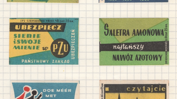
I had no idea what Phillumeny meant until I was given a collection of old matchbox labels bought for a song in a general household sale at David Lay’s Auction in Penzance a few years back.
Phillumeny includes the collecting of matchbox labels, skillets, matchboxes, bookmatches, bookmatch covers, match holders, matchbox holders, bookmatch holders, all related packaging and materials, and everything connected to the match manufacturing industry, which was, of course, particularly strong in Britain throughout the 19th century.
Here is a small selection of some of the labels. They’re wonderfully designed by hand and are all the more remarkable given that they have survived. Much like beer mats, they were destined for the bin and yet they still exist as a rare reminder of past everyday lives. Many carried public information messages as well as advertising the quality of the products therein.
Talking of beer mats, yes, there is a name for someone who collects them too; they’re called ‘Tegestologists’ which to me sounds extremely important. Funnily enough, I do also happen to have a few boxes of beer mats…


Joseph
Soft sell – and no, I am not talking about the 80s rock band that created the utterly timeless anthem Tainted Love – is the continuing message within all marketing strategies. Whilst retail has absorbed this for some time, when trying to expand their brand message, it has become lost within the never-ending sales and discounting that has become the theme throughout lockdown Britain.
So hospitality and travel have taken up the baton with ever-increasing vigour. Relaxation, wellbeing and downtime have all become buzzwords, and even the socially obsessed Gen Z are looking for downtime breaks that include abandoning their phones to escape the pressures of the outside world.
Therefore, how do most brands create the soft sell? Influencers may be the solution. Brands have been using influencers more and more in order to create believability and real life feedback. So in a society where people are praised for searching and developing inner peace and positivity, and there’s a realisation that mental wellbeing is key, influencers’ vulnerability highlights how brands can capture the soft sell approach.
But how do you balance this? The answer is compelling content around how people can create their own experiences with you and how you empower them.
So the days of the hard sell have gone! And it’s now tainted with the love of real people and curated real experiences.
Chris
Google has announced that from 27 September, it will no longer allow sign-in on Android devices than run version 2.3.7 or lower. This means that users with older devices might not be able to access services like YouTube, Gmail and Maps.
This won’t affect the majority of Android users, as this older version dates back to around 2010. However, for those with older phones lying around, it may come as a surprise. It’ll be interesting to see how this pans out, and whether Google is successful in prompting people to update or upgrade their devices.
Cat
Budget supermarket giant Lidl has applied its iconic branding to a playful mini fashion line that has taken UK fashion by storm – and I’m kind of here for it. From dadcore trainers to logo-emblazoned boxers, this cheap-as-chips clothing range has captured the hearts of the British public. We could all do with a laugh right now – and Lidl knows it.
The brand has cleverly pivoted its marketing by taking a knowing look at its bargain-bin aesthetic – even the infamous anything-goes middle aisle now has its own hashtag #middleoflidl. Whilst I’m dubious as to the ethics of a clothing line at such a low price point, I can’t help but applaud the retailer’s audacity and unashamed commitment to their aesthetic, which hits different in an environment of outwardly green-washed corporations trying to distract attention from their less-than-desirable practices.
That’s not to say that Lidl isn’t focused on upping its green credentials: the brand has committed to making 100% of its own-label goods recyclable, reusable, refillable or renewable by 2025 and is about to introduce an innovative traffic light system for eco credentials in its own-brand range, so that consumers can be more informed in their choices. I’ll take some sustainably farmed nut milk and a pair of Lidl socks, please.

