Why have three websites when you can have one?
Why have three websites when you can have one?
Posted by Nixon
These days, almost everyone carries round a little computer in their pocket.
When they open the internet on their small mobile screen, a responsive website will look just as good as it would on a desktop.
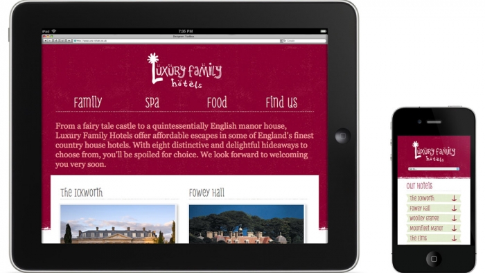
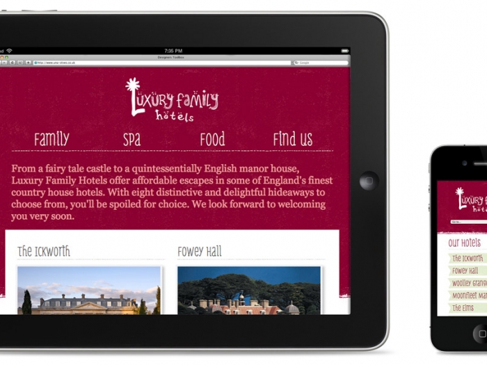
Responsive web design involves using fluid grids and flexible images to enhance a web page for different viewing contexts. Day by day, the number of devices, platforms and browsers that need to work with your site grows. That’s why we need to adapt how the page looks and functions for each format; from a 1600 pixel desktop computer, down to a 320 pixel smartphone. Why would you want pages of text on a smart phone? Responsive means we can tailor the user experience.
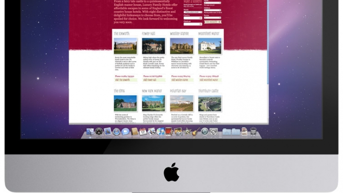
We’re ensuring that all our future builds are responsive. Take a look at our most recent responsively built site that we created for Luxury Family Hotels.