
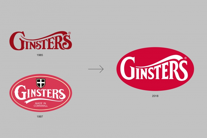
Brand strategy
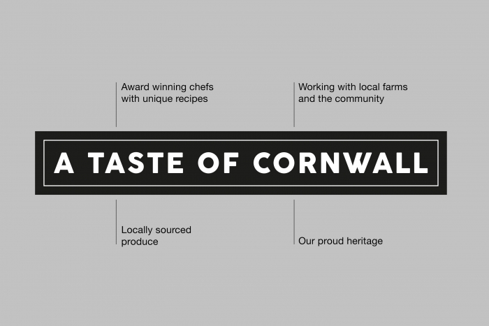
Working in close collaboration with brand consultancy Thoroughbred Communications, we reset the Ginsters brand strategy, shifting its focus away from the generic feeding of hungry men to the compelling proposition of ‘A Taste of Cornwall’.
This essential brand truth led the brief to find a new expression of the Ginsters brand, and set the tone for all future communications.


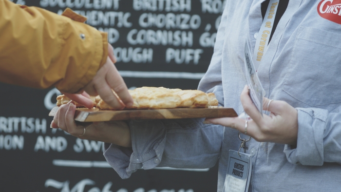
Bringing ‘A Taste of Cornwall’ to life
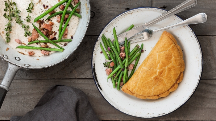
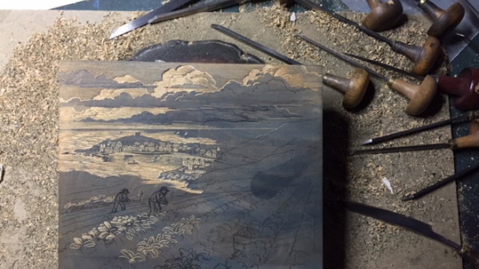
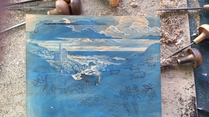
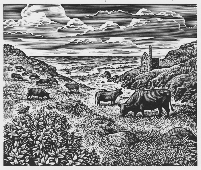
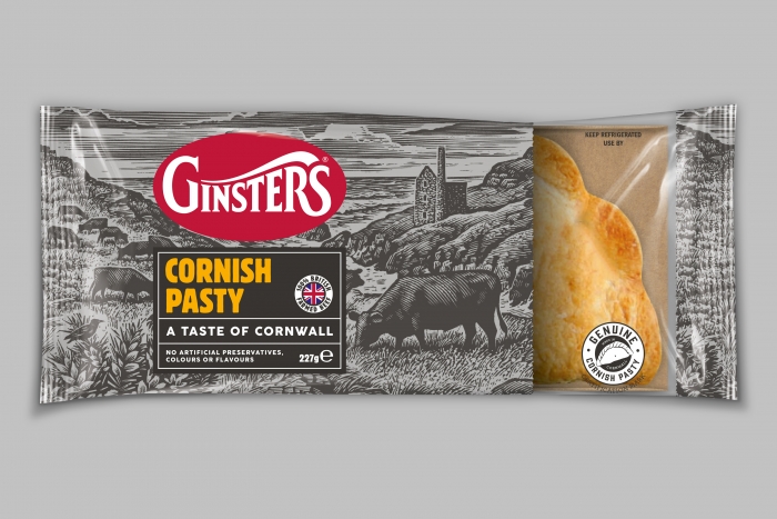
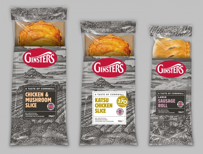
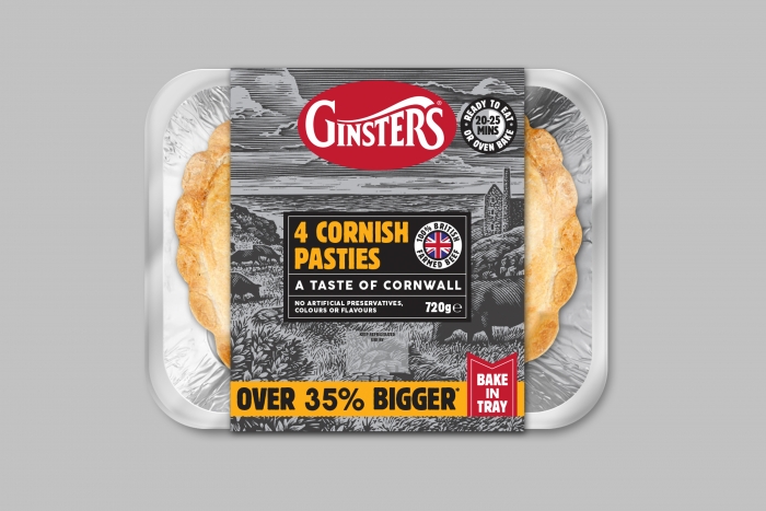
Central to the packaging design was establishing a series of strong and memorable Cornish images that would become the emotive flagships for the brand’s heritage. To deliver this unique route, a series of original wood engravings were commissioned with Andrew Davidson, who created intricate renderings of the Cornish rural landscape, which reflect heritage, geographic location, and commitment to British ingredients. This painstaking method of printing was chosen due to its traditional, handcrafted nature, which works in synergy with the Ginsters brand ethos. With each illustration taking Andrew four days to create, the results add a unique earthy and impactful dimension to designs.
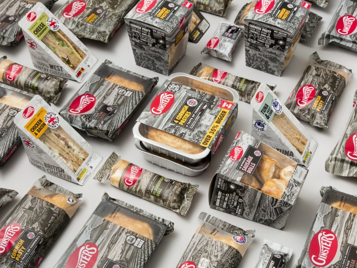
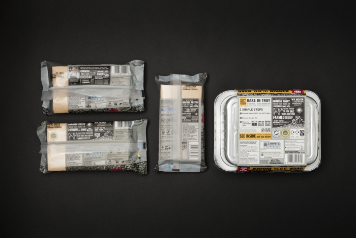
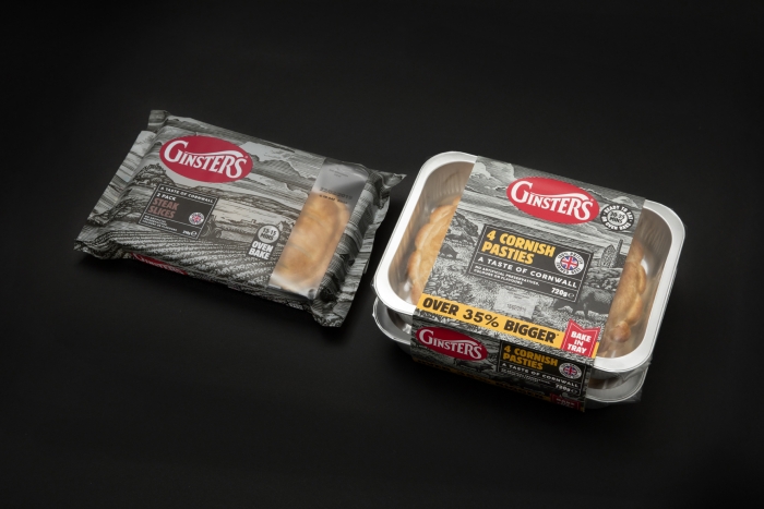
Main range packaging design
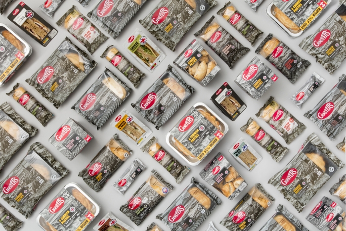
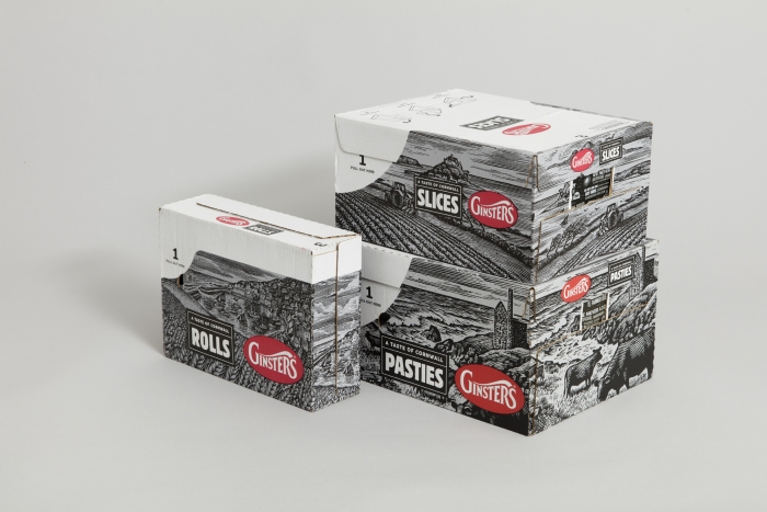
During an intensive six-month preparation for the brand launch, we designed the packaging for every item in Ginsters’ main range, from the iconic Cornish pasty to sausage rolls and slices; totalling around 70 products.
Keeping the brief close
Together with Thoroughbred Communications, we began by exploring the ways in which the packaging could represent Ginsters’ core strengths: its Cornish provenance, quality British ingredients and distinctive taste. The client team were keen to expand Ginsters’ target market; having previously focused on male audiences, they sought to extend the brand’s reach towards the pre-family market and consumers aged 25-44.
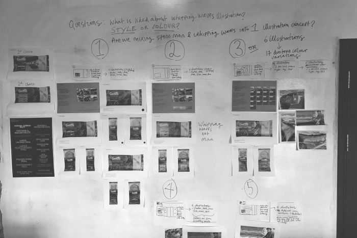
In addition to this, there were a host of new communication factors to consider, including the hierarchy of messaging, the inclusion of a window element to the packaging, product grouping and food packaging legalities, among others. All the design submissions were subject to neuro-testing to gauge relevance in the reaction of consumer groups.

Project management
The day-to-day project management for this relaunch programme was exacting. We worked closely with a number of third parties, including a reproduction team and printers, and the whole project team caught up on a weekly basis to discuss timings, actions and progress. The design development process culminated in our supply of artwork and necessary assets to the reproduction team.

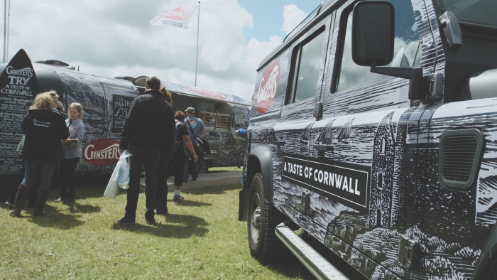
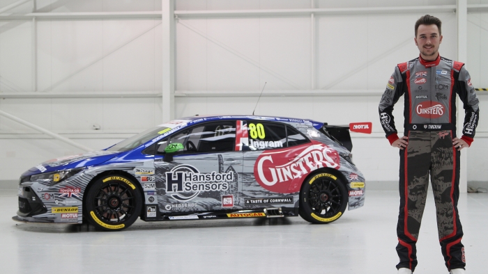
Branded environments
With an established design language in place, we brought the identity to life across a range of surfaces, placing the design into physical spaces. From a racing car in the British Touring Car Championships to an Airstream doubling up as a shop, we applied the rules from the core packaging range for brand consistency and impact.
Brand extensions
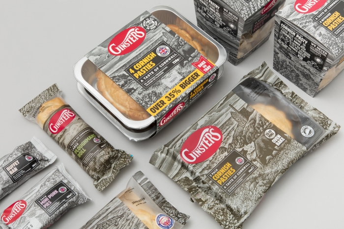
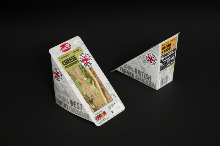
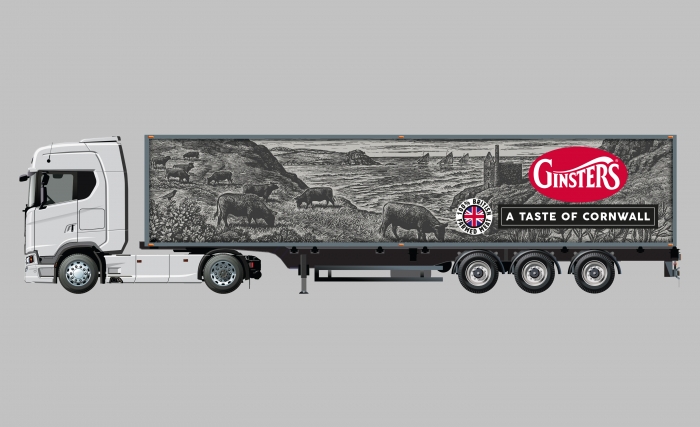
Following work on the primary packaging, we moved on to create other key Ginsters elements, such as shelf-ready packaging for the display of products, van and lorry liveries, snacking and bitesize products, bake-in-tray lines, festive editions and limited-edition pack designs. We’ve also redesigned the brand’s sandwich packaging, which utilises core elements from the primary range suited to the sandwich market.
Each product type carried its own specific considerations, whether this was ensuring impact at large sizes on lorries, or adapting the design to work on new packaging nets. Consistent throughout are a cohesive visual language and the prominence awarded to Ginsters’ core strengths.
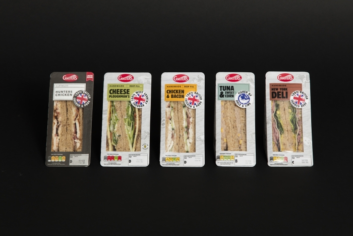
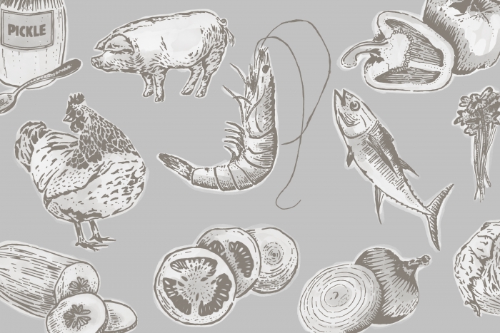
In-house illustration
To work alongside the core range, the sandwich brand extension required a fresh set of ingredient-led illustrations, which referenced the wood-engraved style already developed. We crafted all of the illustrations in-house using traditional methods mirroring Andrew Davidson’s creative approach.