
Insights
We began the process with a UX workshop, in which we discussed the team’s main objectives and decided on the hierarchy of information. The Trust wanted to make it easy for people to find answers to questions via its website, so information needed to be clearly presented and easy for the team to update in the future, without affecting the design.
Ideas
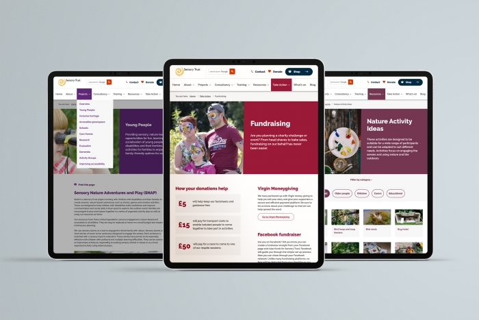
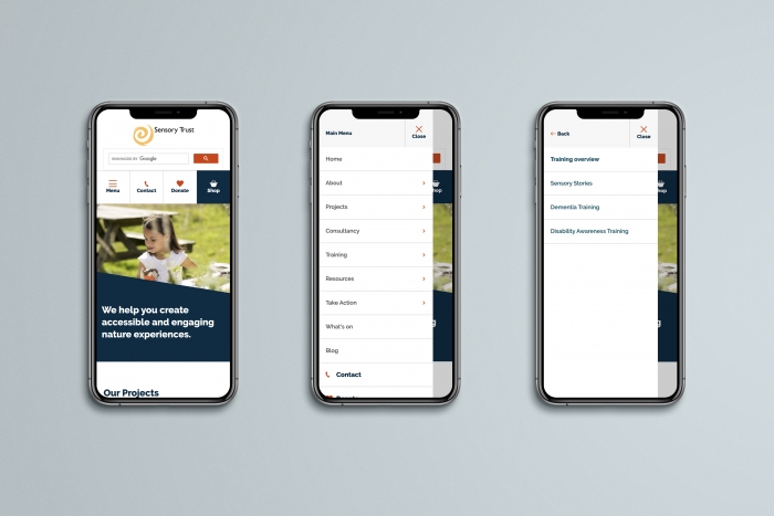
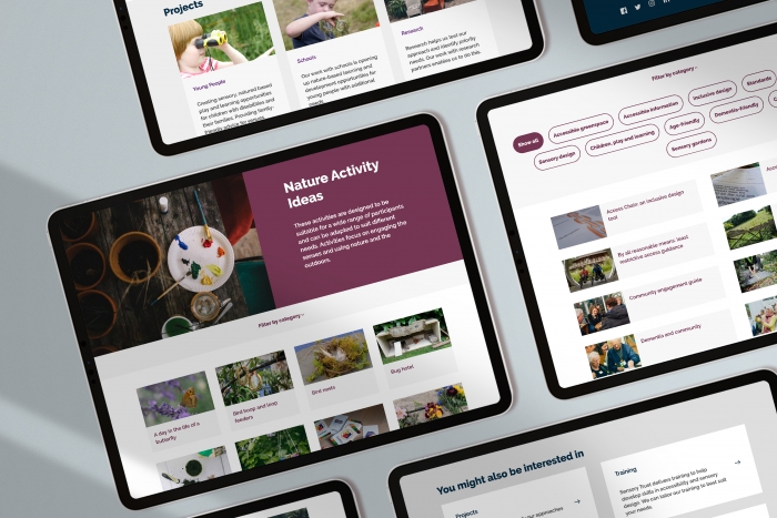
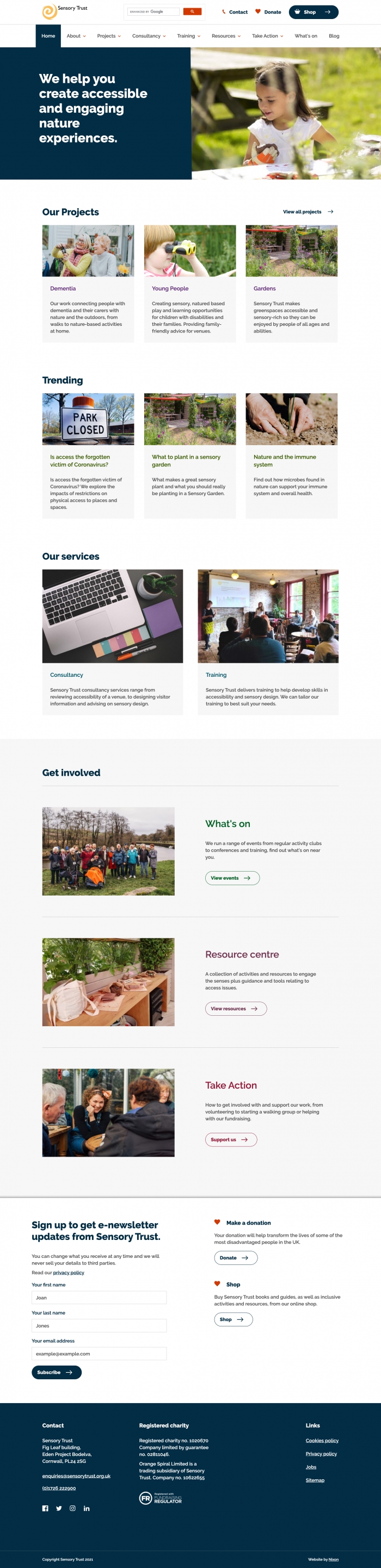
Ease of navigation was a top priority, so we introduced a decluttered homepage with clear signposting, as well as dropdown navigation to allow users to get to child pages more quickly. Filters were added to activities and guidance pages, helping users easily get to the content that is most relevant and valuable for them. Each section of the site was assigned a different colour, helping users to visually recognise which section they’re on.
We also created clear and prominent call-to-actions to contact, donate or visit the Trust’s online shop in both the navigation and footer, ensuring that these are ever-present.
Finally, to increase visibility and further aid users with locating relevant content, we carried out onsite SEO, adding well-researched meta titles and meta descriptions to each page.
Impact
During a three-month period post-launch (Jan-March ’21), sessions resulting from organic search increased by 89% compared with the previous year, while overall traffic increased by 80%.