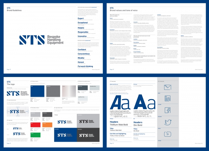
Brand values
First, we visited the STS factory to see first hand what the STS brand was about. We followed up with a branding workshop, exploring in more depth their audiences, market context, points of difference and business goals.
Boiling all this down, we identified five core values. These values describe who STS are and why they do what they do. And they also underpinned the brand voice, the visual design, and the website.
Tone of voice
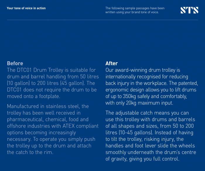
The brand's written style had to reflect its values, so we created a unique tone of voice with a set of guidelines. These contain practical tips on how to achieve the STS tone of voice, sample passages to show it in action, and correct spelling, punctuation, grammar and usage.

Brand evolution
Following a scoping workshop, we gently evolved the brand identity to modernise the company's visual branding without throwing away their heritage. A simple typographic system allows for flexibility across all of their products, where space is paramount.
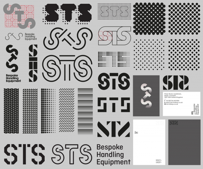
Unused concepts
At Nixon we fully explore all ideas within the framework of the brief and evaluate them against the client's target audience and brand values before narrowing our focus.
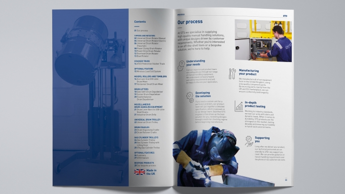
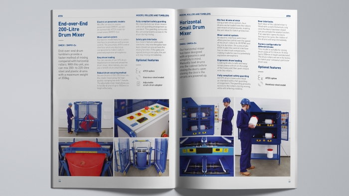
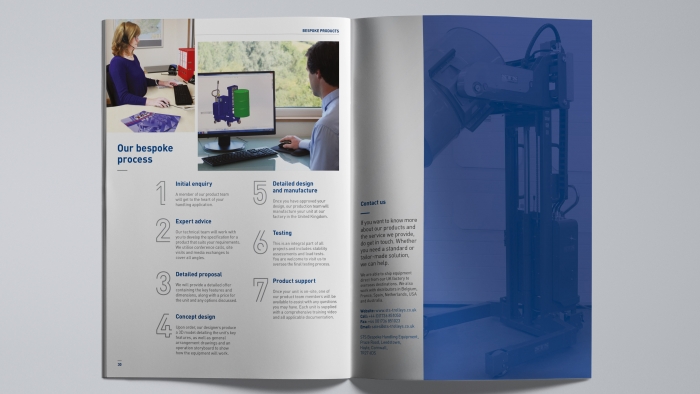
Product brochure
The product brochure is the business’ main point for driving sales. The team wanted something that would put the browsing experience at the centre, giving prospective clients a true visualisation of each product as well as clear instructions for use.
We worked to merge these important visuals and information into a readable, eye-catching document.
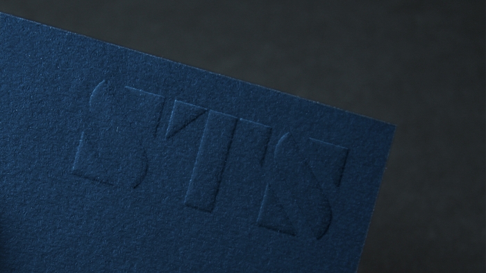
When it came to print, we included an embossed logo on the cover to give the brochure an element of quality and tactility.


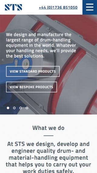
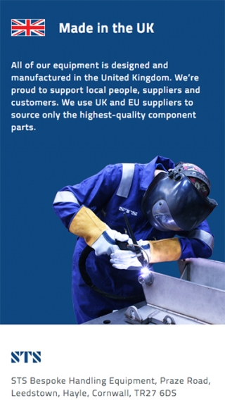
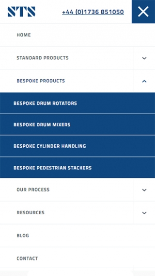
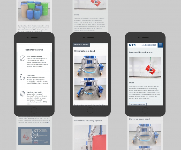
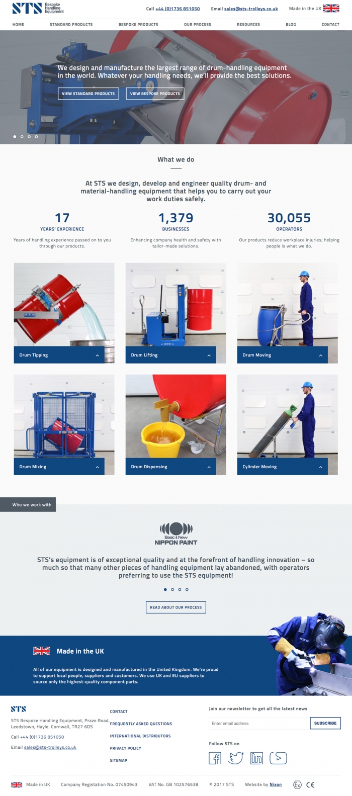
Website
We brought the company’s digital presence up to date with a responsive website that reflected the quality of their offering. During a factory visit, they showed us how easy and intuitive their products were to use. This became a driving idea behind the UX design – we wanted to build a website that was sleek and simple to navigate.
Implementing our concept for the brand tone of voice, we also offered copyediting across the site to make sure that the written content was consistent with the brand personality.
Zac Jones, Business Improvement Manager
Working with Nixon has been a brilliant experience. Refreshing our brand identity has been very rewarding, workshops with the team delved right into the heart of the business. Nixon has taken our decade-old website and transformed it into a place we’re excited for our clients to visit. The site showcases everything great about our products and is admired by our customers from all over the world.