
The concept
We started by identifying the audiences and the aims of the project. Prospective students need to be excited and inspired, while parents want to know that their children will get the best education, so we had to balance these things. We separated the prospectus into two narratives, one to attract and entertain a primary school child and one to inform the parent.
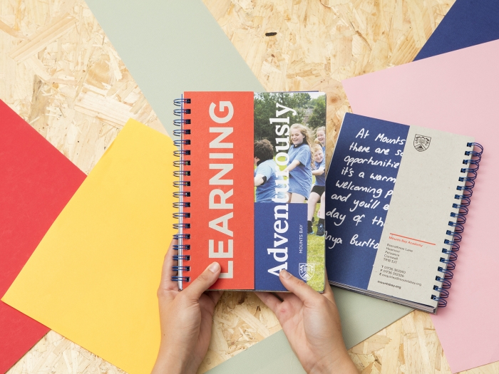
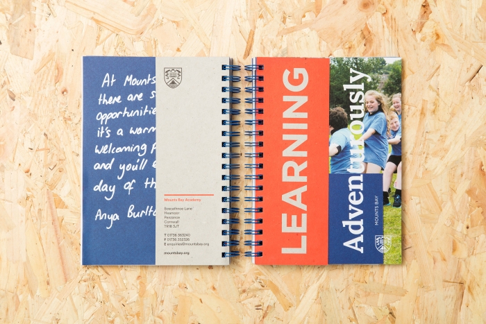
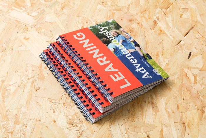
This dovetailed perfectly with the academy’s adventure learning ethos, a progressive approach to teaching that gets great results. We flipped this phrase around to become ‘Learning adventurously’ – the title and unifying theme of the project – balancing school experience and academic results, yet prioritising education. We then swapped out ‘adventurously’ for words based on the academy’s values, with each value becoming a section and guiding the content.

The format
We explored different ways to represent these two themes in the design and format, deciding on a wiro bind with cut-out content inserts. The inserts provide the factual information, while the main spreads showcase the school experience. With the two content types physically separated out, the audience – whether parent or child – can interact with the prospectus as they like, and each theme supports the other. The wiro bind is also reminiscent of spiral notebooks, and the whole piece looks and feels unusual and exciting.
Gathering content
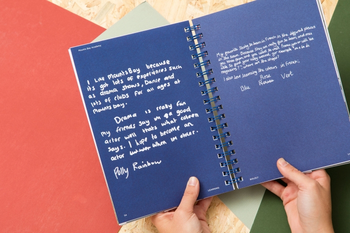
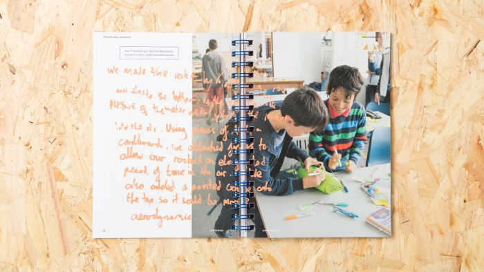
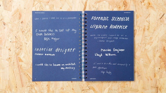
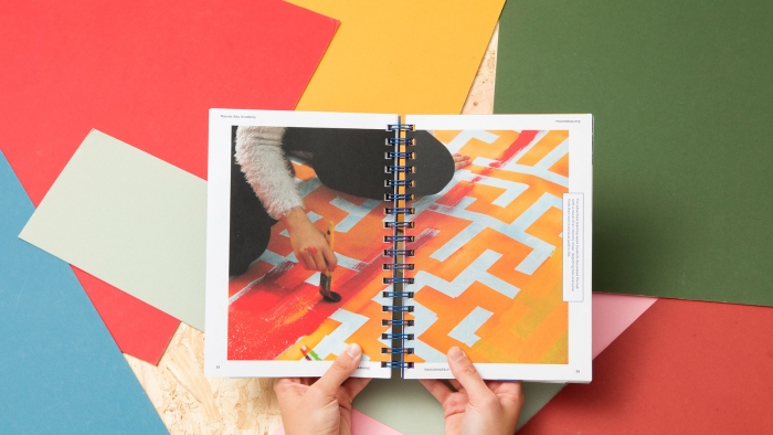
Turning the usual process on its head, we went to the students for the experiential content. It’s an anti-prospectus, after all, and who knows the school better than the students? To kick-start the project we met with a small group and discussed what they thought was important about the academy, which sparked our ideas for content. We spent a lot of time at the academy, seeing what it was like during a normal school day, sports day and adventure learning week, and talking with students and staff.
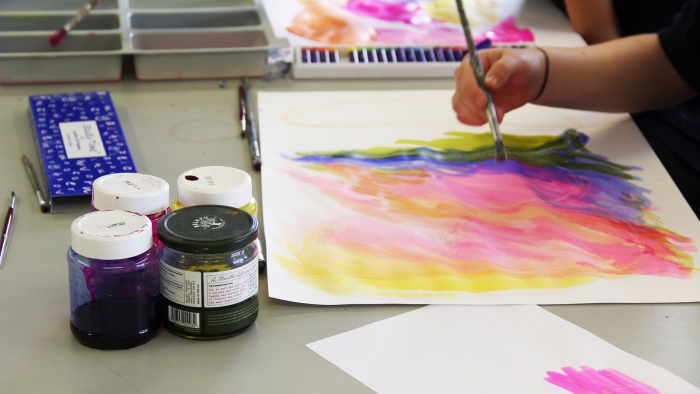
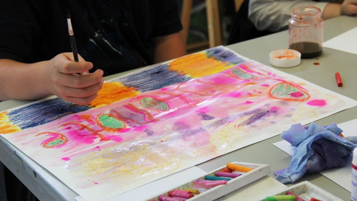
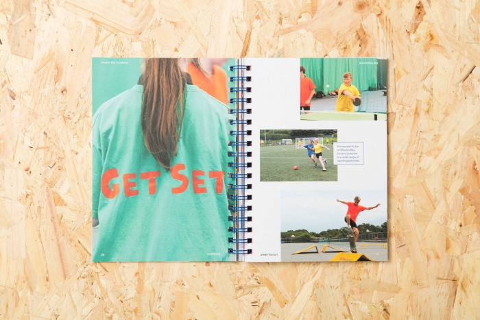
The result is a colourful and expressive piece that gives a true idea of what it’s like to be a student at Mounts Bay Academy. From poetry, opinions and personal thoughts to artwork, equations and aspirations, the prospectus is packed with student work and insight. The candid shots of happy faces tell the whole story.




Copywriting
For the informative dividers aimed at parents, we drew up a page plan and researched the content, picking out the academy’s selling points and important details. Each insert needed to be roughly the same length, and each value had to have the same amount of inserts. We wrote in an energetic and accessible style, which reflects the academy's ethos, instils excitement and allows the reader to easily digest the text.
The snippets punctuate the prospectus, giving the parents everything they need to know without overcrowding the visual content on the main spreads.


Sara Davey, Principal
The prospectuses have been received by parents and visitors alike to universal acclaim. Our recruitment numbers for this year are buoyant both for next year’s Year 7 and in-year admissions. The team at Nixon was a joy to work with because they helped get underneath the skin of the Academy and produce a prospectus that is both authentic and beautiful. Thanks once again to all the team.
